Brief:
The aim of this coursework was to produce a front cover, contents page and double page spread for a new music magazine for a genre of my choice. However it had to conform to the codes and conventions of existing media products.
Planning & Research (20 marks)
Schedule - I started the course later than some of the students on the course.
Evidence of Planning & Research - Before Starting the course:
Prior to choosing the music genre I wanted to create a magazine for, I wanted to look at existing media products to get ideas and find out what the structure of my magazine should be. I chose to look at Q magazine as it is a well-established music magazine that has no specific genre but instead provides collective content on a wide range of music genres. It is a popular magazine due to this and therefore using this magazine, as the basis for my planning and research will help me to be successful when creating the full product.
Planning & Research - PowerPoint:
Analysis of Chosen Sub-Genre
Audience Research - Survey Monkey and other evidence:

Preliminary Task
Hand drawn drafts and ideas:


Front Cover

This was the final version of the front cover of my preliminary task. I got to the finished product after making 2 or 3 changes because of feedback I received from various different people. Some of these changes included making the main headline even bigger, highlighting the word 'prefects' in maroon, using the 'Staples' logo instead of just writing 'Staples' and lastly making sure the cover lines stood out against the white background and dark background of the maroon blazers. I chose not to add secondary images to the Front Cover firstly because I thought it would make the Cover look to crowded and I also didn't want the focus to be on the images, but instead on the featured stories.
Contents Page

This is my finished Contents Page for the preliminary task. Similarly to the Front Cover I also made a multitude of changes after showing people my first draft and receiving feedback. Initially the text underneath the sub-headings were written in the same cursive font as the name 'Contents' however I then changed it to a simpler font so as not to overwhelm readers with complicated cursive font and also to differentiate the headlines from the stories. I also included a drop capital, social networking logos and a subscription offer, so that readers can easily keep up to date with each issue of Paul's people.
Main Task (60 Marks)
After completing my preliminary task I was ready to begin with the real deal! This section shows the planning, research and evaluation for the Hip Hop magazine I created entitled '8O8'
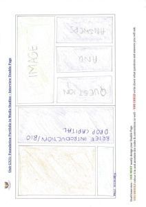
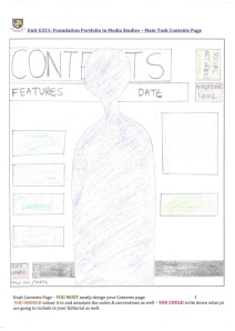
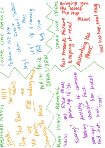
Hand Drawn Drafts
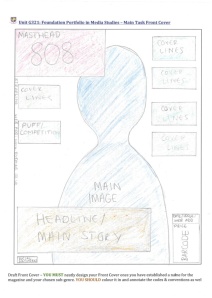


Front Cover

This is the finished product for my main task front cover. Yet again I produced an initial draft, which I then received corrections for. The main changes I made were to add a couple more cover lines as there were some empty spaces, make my headline stand out by making it bigger, changing the colour to red and using the 'stroke' tool to outline it in white. I also included a publisher logo by the barcode. The most significant change I made to the front cover however was the main image. I tried many different images but none of them seemed to work, but I finally chose this picture which I think worked extremely well. By making all these changes I was able to get my magazine close to if up to a professional standard and make it look aesthetically pleasing.
Contents Page
1.

2.

These were my final two contents pages. I decided to do two contents pages because my magazine of inspiration, XXL, also had two contents pages. After the constructive criticism I received the changes I made to the 1st contents page was to make sure the text underneath the headlines didn't overlap on to the image as this would reduce the visibility of the text. I also added social networking logos and the date and a website address at the bottom of the page. For the second page I improved it by using the pen tool to add a drop capital, I changed the page numbers where you could find the stories to red to make them stand out and I also added my signature below my editor's letter.
Double Page Spread

Last but not least here is my finished double page spread. The changes I made after I received my feedback was to separate the columns using dotted lines, differentiate between the interviewer and the interviewee by putting the interviewers names in bold and keeping Drake's name normal. I also added rectangular black bars to the top and bottom of the page in order to be consistent, as the contents pages also have black bars at the top and bottom of the page. I also included a drop capital at the start of the introductory paragraph. I also highlighted the word 'Twitter' in its signature colour of blue to remind readers that this is another social networking site where they can keep up to date with news about 808 magazine. This helps promote the magazine on different platforms and therefore helps it to reach a wider audience.
Evaluation (20 Marks)
Other media to include:
In conclusion I think I managed to successfully create my own media product in the form of 808 magazine based on other existing media products such as XXL magazine. If I had the chance to do this again I would definitely manage my time even more effectively, even though over the course of creating this product my efficiency has increased a great deal. I am very happy with the outcome and thoroughly enjoyed doing and completing this coursework.

fab!!